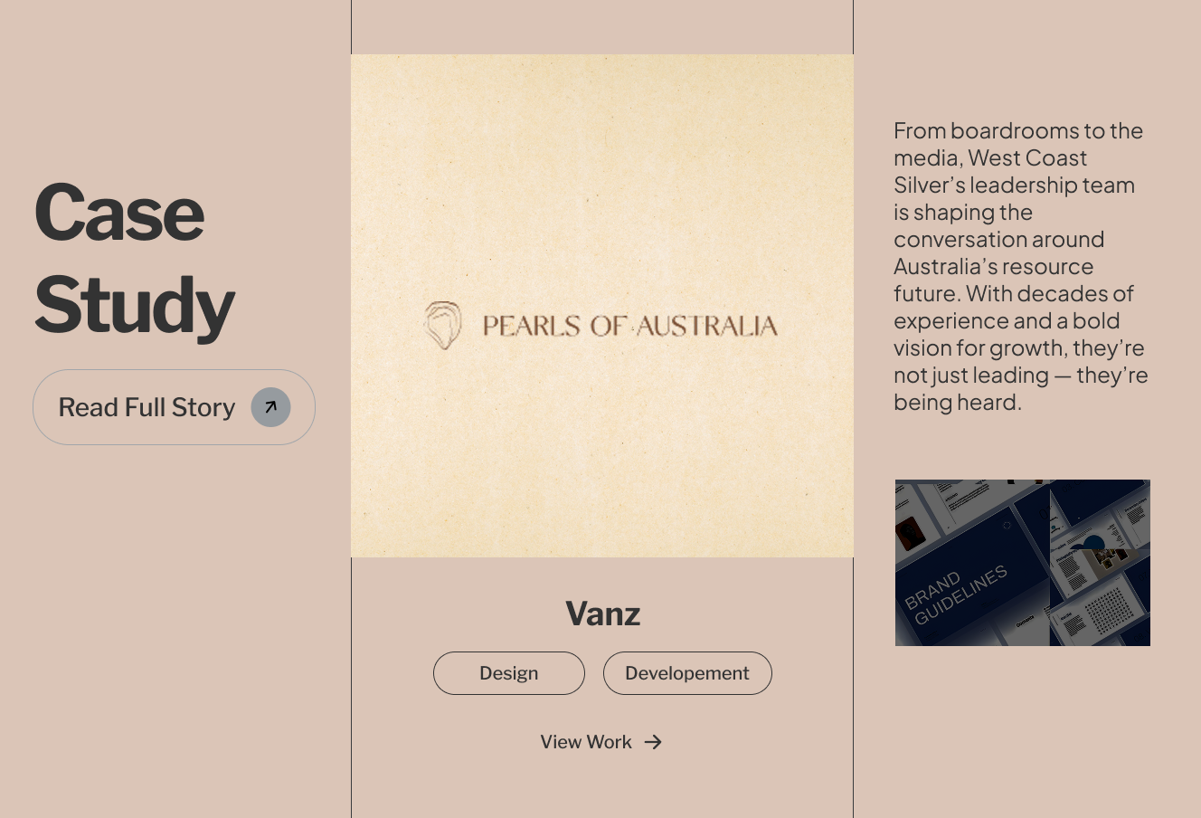
Pearls of Australia
WebGx
Jewelry | E-commerce
The moment that Pearls of Australia first came to us the first time, they already had something unique — breathtaking South Sea pearls, a long and rich history behind the farms they run, as well as a real connection to Australia’s coastline. What was the problem? The website was not doing the job.
It wasn’t extravagant or user-friendly. Most importantly, it didn’t help their business grow as it was supposed to. The images didn’t show the quality of their jewelry, the number of mobile users was declining rapidly and important elements of their business, such as farm tours, and the brand’s story telling were mostly invisible.
The company needed a website that didn’t look nice, but actually did what they wanted it to. It allowed customers to discover, connect and become enthralled by the brand – whether they were shopping for jewelry or arranging an excursion.
This is where we got our start.
We didn’t jump straight into design. Instead, we began by asking the appropriate questions: What are their clients? What is it that makes their story special? What does the experience need to feel like? After we got that clarity and understanding, we developed an approach that governed everything from layout choices to color choices to how we organized the content.
We assisted Pearls of Australia in transforming their online presence with sleek, modern designs that placed their mission (and their precious pearls) at the top of the list.
The current website had a functional design, yet it didn’t convey the elegance or sophistication associated with the branding. The product pages seemed disconnected from the overall story. The mobile experience was not impressive. There was a distinct gap between the visual identity of the brand and how it was presented on the internet.
Overall, the brand’s warmth as well as distinctiveness were not evident.
To resolve these problems, we followed our well-defined WebGx website design strategy that we’ve refined over the years to accommodate e-commerce and lifestyle brands.
Before we jump into designing, we begin by knowing. Our team arranged several strategy and discovery calls together with Pearls of Australia’s Pearls of Australia team to fully understand their beliefs, stories customers, as well as their challenges.
We covered:
We also analyzed competitor sites as well as global brands of pearl jewelry to find out how we could help Pearls of Australia stand out without losing their core.
After discovering, we conducted studies into three primary customer types:
For each of our audiences, we sketched out their experience might be like on the website such as what concerns they’d ask, which pages they’d first visit and the places they’re most likely to interact or convert.
Then, we created flow maps of users that aid us in structuring the layout.
After we were clear on the flow and goals We sketched low-fidelity wireframes that we could use to illustrate:
This was done before any fonts, colors, or images were added simply grey boxes, and a hierarchy that would guarantee accessibility.
We also identified areas where content could be expanded or be reorganized, particularly the educational content on pearls cultivation, sustainability, and pearls.
After the wireframes were secured and wireframes were secured, we started to explore UI design. Our goal was to enhance the appearance without compromising the warm, coastal image.
We chose a soft and earthy color palette that was inspired by seafoam, sand and polished pearl hues. The typefaces were selected carefully to strike a balance between luxury and readability Classic serif headlines with modern, easy-to read body text.
We made sure that everything was neat and minimal, with plenty of white space and soft hover animations and a refined iconography.
On the pages for products we allowed the pearls to be the main focus. We made use of full-width hero photos with zoomable galleries and sophisticated product narratives that include the origin story and corresponding suggestions for products.
With the knowledge of how many people browse and shop on mobile phones, we took the time to make our mobile version user-friendly and quick. Each screen was designed to be optimized, there was no pinching, no awkward buttons, and nothing was left out.
We conducted tests on iOS and Android tablets, devices and a variety of browsers to ensure that we provide a consistent and beautiful experience across all devices.
Design doesn’t just revolve around the way something appears but also the way it works. We’ve built in subtle conversion signals:
We also made sure that customers could effortlessly switch between shopping and exploring the farm experience and learning more about sustainable practices without losing their spot.
Before launching, we ran the entire website through several tests. This included:
Then, after everything had looked, felt, and performed right, we jumped into the water.
This is a look at what we designed in support of Pearls of Australia:
Instead of jumping right into product pages, this homepage welcomes users to explore the brand. It’s a slow scroll through natural images, videos from the coast, and callouts that draw attention to the people and their heritage as well as the purpose. The result is elegant and personal.
Every piece of jewelry has the same layout, which includes:
Suggested product pairings
Integration of checkout and carts with ease.
We also gave the tours on farms their own special experience pages featuring rich images as well as descriptions and an online booking. It’s like planning a little adventure.
We developed pages like “Pearl Types,” “How We Farm,” and “Meet the Team,” designed as digestible blocks that include pictures and calls to discover further. They’re not sales pages, they create trust and strengthen emotional connections.
In the initial few weeks following the launch of the site, Pearls of Australia saw:
Fantastic feedback from repeat customers who say the site “finally feels like the brand”
The creation of Pearls of Australia’s website Pearls of Australia website was one of those occasions where everything clicked. The brand was heartfelt, and its products had a long heritage. The team that was behind the project was enthusiastic. It was just a matter of translating the passion into digital form.
We at WebGx think that when strategy is combined with design and storytelling ,you don’t just create an online site, you create a place that people are eager to return to.
This project helped us realize that, even in the midst of e-commerce, the emotional connections matter. It’s not always about being louder or brighter. It’s sometimes taking a step back, selecting peaceful colors, telling genuine stories, and then letting the quality shine.
We’re thrilled to have been able to help Pearls of Australia take this next step in their online journey, and we’ll cheer them on as they continue to expand, farm, and spread the beautiful beauty of Australian pearls with the world.
“From the beginning, the WebGx team truly understood what Pearls of Australia stood for. They took the time to learn our story, our roots, and our values, and turned all of that into a digital space that feels like home. The site reflects our heritage and product beautifully — it’s calm, elegant, and genuinely us. Working with them felt like a real collaboration, not just a service. We couldn’t be happier with the result.”
— Pearls of Australia Team