
We provide responsive website designs that combine thoughtful UI/UX design with development that lasts in the browser. We build all of our projects on WordPress, Shopify, Wix, or Webflow, and your site’s layout, images, and navigation all adjust automatically to any device, without sacrificing speed or usability. We combine well-thought-out UI/UX design with development that lasts beyond a design file and into the browser.
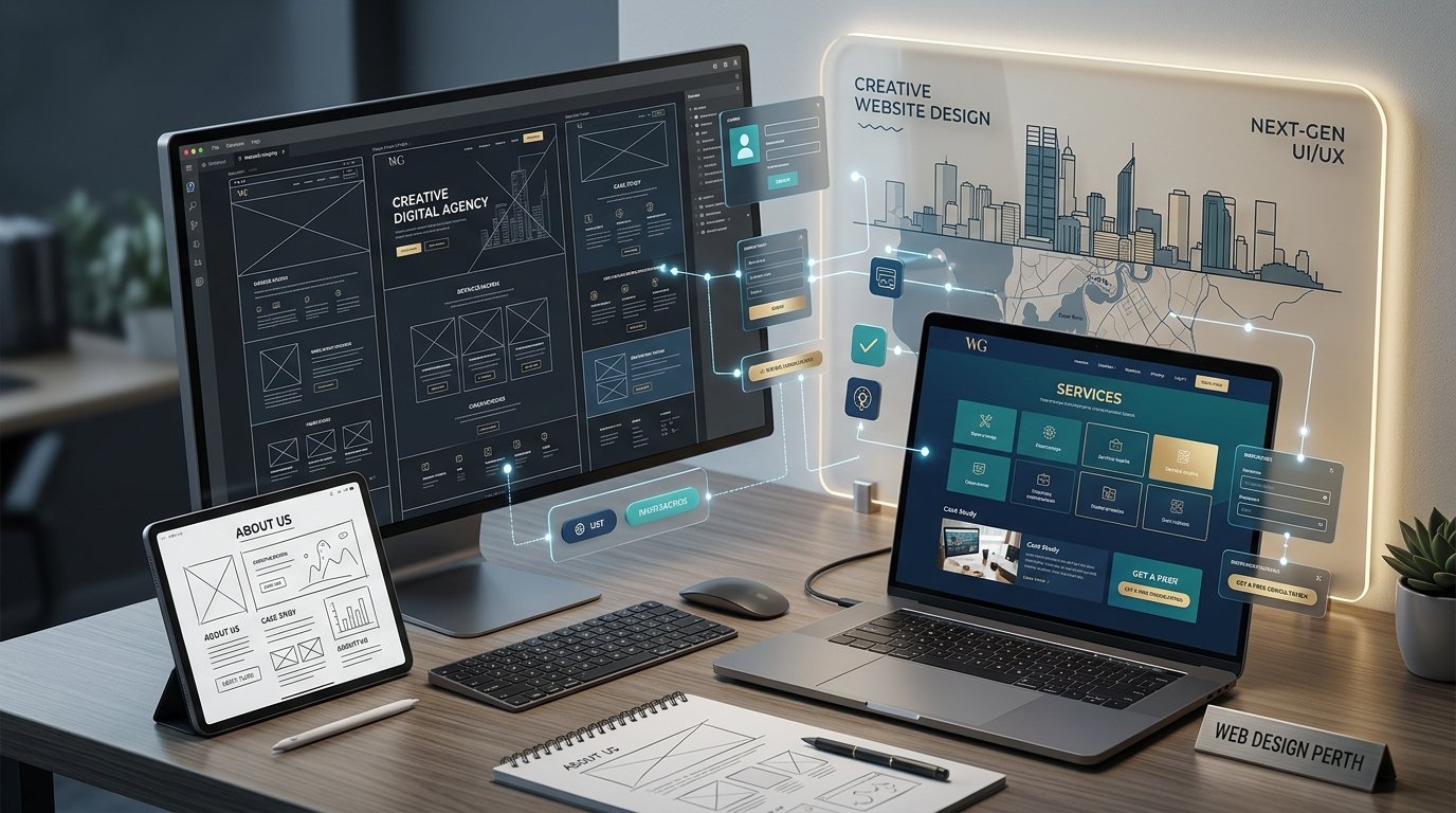
A responsive website adapts to whatever screen it is displayed on handset, tablet or desktop monitor and delivers the same polished experience across all devices. We live this principle in all our interactions, with seamless grids that grow and shrink in proportion. We design buttons, menus and forms to be touch friendly, sized and spaced for a finger, not a cursor. We also optimize the way images and media are displayed on the requesting device, directly impacting Core Web Vitals like Largest Contentful Paint and Cumulative Layout Shift.
First, we get to know your business, your audience, and the shortcomings of your existing website. That gives us a clear scope and a platform recommendation rather than a boilerplate pitch.
We do not start building straight away. We map layout, structure and user flow, share the design for your feedback, and provide revisions until you approve it. Development starts only after that.
We build your website on the agreed system, customizing themes, integrations and functionality to your project. We provide progress checks to ensure there are no surprises when the build is finished.
A website should work as a lead generation engine, so we check the whole user journey before going live. Every form submits to the right place, every call to action points to the right page, page speed meets Google’s recommendations, the site is secured, and responsiveness is verified across all devices.
Unlike a template builder, each engagement starts from a design file. Before any line of code is written, we design the layout, hierarchy, and user flow with you, making choices deliberately, not haphazardly.
We create websites that are mobile first and test them on real devices, not on a resizing browser trick, so layouts are true to form on handset, tablet or desktop, and not just in theory.

We build for the people who are actual users of your website, what they are looking for, and what is stopping them enquiring or buying. Then we present the selling points that genuinely matter to them, in the places where the decision gets made.
Launch is not the end of the road. Speed, security and updates are monitored after deployment, so your website performs to the same standard it did on launch day.
Five core services, each shaped around how your business actually works rather than a generic template.
01
Positioning, logo, colour and typography, built into a system your website and marketing can both run on rather than a PDF that sits in a folder.
02
We map the path visitors actually take, where they hesitate, and what gets in the way of converting, then design the interface, navigation and content hierarchy to clear those obstacles. Visual hierarchy is deliberate, menus are legible, and calls to action appear exactly when someone is ready to act.
03
Built on WordPress, Shopify, Wix or Webflow with proper heading structure, fast-loading sections and SEO-ready foundations, so search performance is part of the build rather than something bolted on after launch.
04
Checkout flows, product pages and category layouts designed around how your customers shop, built on Shopify or WordPress with the payment gateways and inventory systems your store needs. Straightforward for customers to buy, and straightforward for your staff to update without calling a developer.
03
Platform recommendation, a review of your existing site, and a clear view of what to fix first — useful whether or not you go on to build with us.
Short attention spans are the reality now, which is why we build sites that move visitors forward instead of overwhelming them. Within the first few seconds, a visitor should know what your business does and what to do next, with no scrolling and no second-guessing. Calls to action appear across the page rather than only at the bottom, and the visual hierarchy leads the eye toward each next step. Testimonials, credentials and case studies are trust signals, so they sit where people will see them rather than at the very end.
We don’t relinquish a Figma file and leave implementation to another party or to you. Your website is designed in Figma by the same team and then built pixel perfect in WordPress, Shopify, Wix or Webflow. There’s no handoff to another team, no reinterpretation, no compromise on the details you approved, nothing gets diluted in translation between design and development.
You are dealing with one team, responsible for the design and construction of your site.
There’s no loss of information between Figma and launch.
All details are as per your approval.
No more explaining your vision to a new developer.
The same look and feel on all screen sizes.
A quicker and smoother route from design to live site.
Responsive web design is a method that allows a website to automatically adjust its layout, images and navigation to fit the screen size of the device used, whether it’s a handset, tablet or desktop, ensuring that the experience is consistent and usable across all devices.
The price depends on the platform, number of pages, integrations, and content readiness. A professionally designed website will usually start in the low thousands of dollars and rise from there based on the scope; larger and more complex builds, with custom features and e-commerce, will be more expensive. We quote you a fixed price once we have an understanding of your project, so there are no surprises when we start work.
The time varies depending on the platform and the complexity of the website, ranging from a few weeks for a simple brochure website to several months for a larger bespoke or e-commerce website. We furnish an honest timeline as part of your quote.
Yes. Our most common projects include website redesign, which can be a complete overhaul or shifting on a new platform, or a website design update that keeps your current CMS but updates the layout, user experience, and performance.
We build and design on WordPress, Shopify, Wix and Webflow, and we will use the platform that suits your business needs best, not just the one we’re used to.
No. Our office is based in Perth, but we work with clients around the globe and are available during the same business hours, no matter where you are.